
Your B2B website is incredibly important. It’s where people go to learn about your business and what you have to offer. It’s where people go to connect with you and ultimately the place where people decide if your company is one worth exploring further. So what makes a good website? Here are 4 B2B website examples that showcase the best practices of how website design affect B2B sales.
The Complexity of the B2B Buying Journey
First, to understand a website design’s impact on B2B sales, you need to understand the B2B buying journey. The journey of a B2B buyer is far more complex than that of B2C. While marketing in both verticles tends to focus on solving a pain point, B2B buyers often narrow in on one core problem and they are looking for a specific solution. Typically, they are looking for a way to accomplish something better, faster, and more efficiently. That might include new tech that automates existing processes, more reliable supply chain partners, software to update an antiquated process. The list goes on, but by and large, business buyers are looking for fixes.
Furthermore, very little B2B purchasing is done on a whim or impulse, and that becomes increasingly true as the sticker price increases. For that reason, purchases, and the journey to purchase, are often drawn out. There are more people involved in the buying process than consumer purchases, and often approvals and buy-ins are needed at many levels. There are existing, internal processes to consider as well. What might seem like a small investment can impact an entire organization. For example, new software can drastically change the day-to-day operations of whole teams, a new supplier might require new equipment and big expenses in training.
Because of that, B2B buyers are also looking for information. They need to be informed, empowered, and confident before taking options to their teams. Upfront and easy accessibility to information is critical.
Lastly, businesses are looking for products they can trust- ones with positive reviews given by other trustworthy companies. As mentioned, there can be a lot at stake for B2B buying, and reviews and testimonials can go a long way in mitigating some potential perceived risk for buyers.
B2B Website Design Needs to Be for Conversion
So how do you translate that complex buying journey into a website? Understand that given all of these variables, “Buy Now” likely isn’t going to work up front. The goal is ultimately a purchase for B2B, but B2B products and services are usually something you don’t buy upon the first visit to a site, or even third or fourth visit for that matter. That’s why B2B website designs all need to be designed for conversion and nurturing at every point in the buyer’s journey.
Examples of Great B2B Website Design for Tech
Here’s what we mean. These four B2B tech websites are examples of websites effectively designed for B2B sales.
Slack
Who doesn’t use Slack these days? We love the app, but we also love their website. First, without needing to scroll or open any links, you can immediately tell what the product is and what it does. We call this the “Blink Test.” Within a few seconds, the main header, images, animations, etc. tell me the basics of what the product is and begin to illude to why I need this product. There are also two prominent and actionable CTAs within the hero space, Free Trial and Contact Sales. Neither of these CTAs are pushing the user into buying immediately, which goes in line with that typically longer B2B selling cycle we talked about earlier.
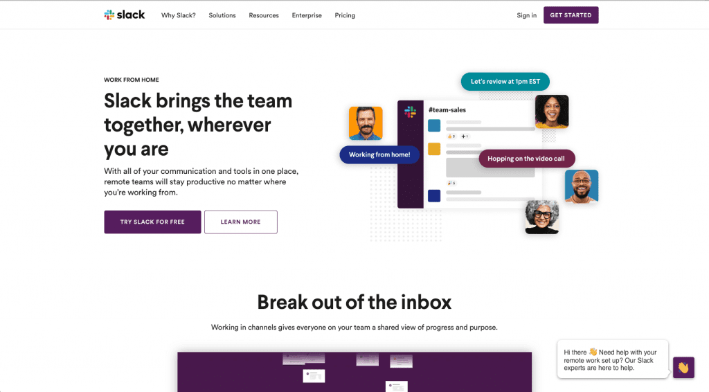
Additionally, as you scroll down the homepage, you see a section with reviews and the logos of respectable companies who use the app. This builds authority and trust with the audience while also creating a subtle bandwagon effect.
Lastly, toward the bottom of the page, there are links to Slack’s resource center where you can download helpful eBooks, read blogs, and watch webinars with product tips and helpful information. These eBooks offer conversion opportunities for Slack to nurture their prospects that aren’t ready to commit yet. While most are bottom of the funnel (specific to the Slack app), others are awareness and consideration content. That means these pieces are intended to inform and aide a user along their journey, not push them into buying. (This is all part of the inbound methodology. Click here to learn more about Inbound and why it works.)
Asana
Asana is the project management tool we here at Lake One use. We’d be lost without it. Their B2b website design is clean, minimal, and has little bits of fun design and personality. They pass our “blink test” with flying colors by providing very clear, precise headlines explaining what the product is and why it’s the best choice for a project management tool.
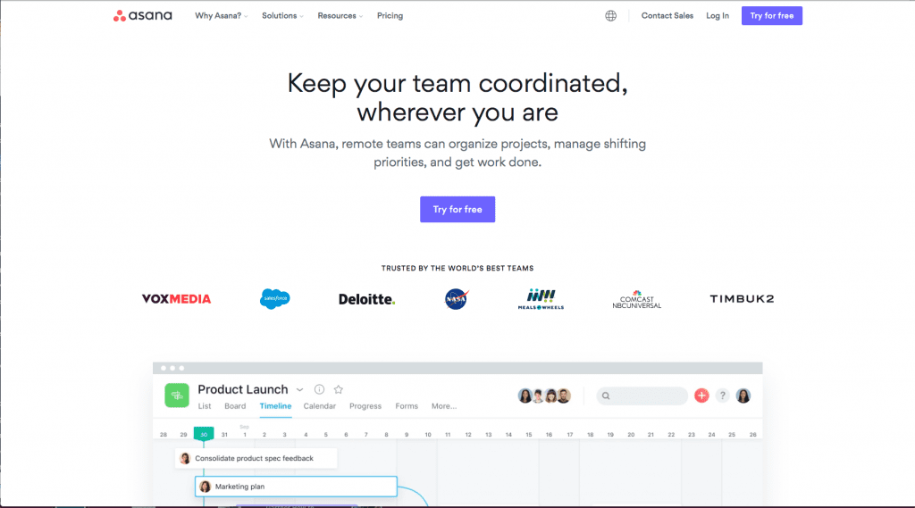
Asana leads with Try for Free CTAs. Again, these are not directing people straight into buying or having to speak with somebody just yet. The beauty of CTAs like this is the opportunity to nurture a lead. You can set up workflows to send automated marketing to the lead shortly after signup or during the trial window that softly nudges them into the next step toward a purchase. When done right, this can be an extremely effective tool for conversion.
Related Reading: Essential Marketing Automation Functions to Put Your Lead Management on Autopilot
Asana then builds its authority via logos of partner companies and moves into a video on just how easy it is to use. After more credential building via reviews and more product highlights, another CTA is offered. A CTA at the bottom of the page is a standard best practice.
Unbounce
Unbounce is a tool that allows you to create high-quality landing pages optimized for better conversion. It’s no surprise their website makes our list of best in class. Immediately, the headlines tell you exactly what the product is and how it helps. Notice a theme between this site and the others yet? That “blink test” is critical for holding attention and interest. Unbounce users are likely coming to them for one thing: increased conversions. That’s why their rotating headlines are so perfect- they recognize their user pain points and quickly position themselves as the best choice to fix it. The headlines are simple, solution-focused to a very specific problem most website visitors have, and user-centric. The subheadline then clinches the deal by explaining how in a precise manner. Additionally, the graphics that rotate with the headlines subtly provide the hard data many B2B users need to provide in order to get buy-in and approval on an expenditure.
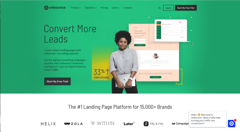
Again we see the Free Trial CTA coming in clutch. Selecting software is a highly personalized choice, especially for a product with a high barrier to exit like Unbounce. There are so many variables, unique business elements, and specific business goals that need to be taken into consideration before making a software purchase. Without getting hands-on, it’s hard to know if a product will deliver on those needs. Additionally, while a website can spout off about their product’s ease of use all day, you won’t actually know how easy it is for you to use until you’re in it.
Related Reading: Turn Your Website Into a Lead Machine with HubSpot Lead Flows
Unbounce also uses video to help simplify the complexities of the product quickly. These are appealing, attention-grabbing, and effective. Lastly, they include their logo parade and testimonials to build credibility.
Vidyard
Lastly, let’s talk about Vidyard. “Vidyard is the easiest way to create, host, and share videos so you can keep connecting with customers and colleagues when everything else feels remote.” That subheadline is so clear I can copy and paste it in here and tell you exactly what they do. The main headline is also user-centric and provides a quick answer to the question all users will have, “what’s in it for me?”
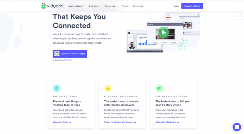
Vidyard then has a Get Started CTA. This one is a bit different because they offer a freemium subscription method. That means you can use it for free with limited access. In order to get full product utilization, you need to pay.
Another thing Vidyard does well is delineating their persona and industry paths. This can be an incredibly effective B2B website design element. Three separate CTAs lead to different content and offerings depending on if you’re in sales, communications, or marketing. This shows a great deal of understanding on Vidyard’s part about their personas. They know that each has unique needs and problems. By speaking to them directly, they can better serve the user with the most relevant, helpful information.