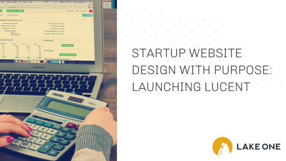
At Lake One, we love partnering with startups. We thrive off the excitement and momentum that comes with the launch of a new company.
Recently, we partnered with Lucent Tax Relief, a startup based out of Central Minnesota that specializes in helping people address their IRS and State tax problems. A critical part of the launch and really the foundation of our inbound digital marketing strategy, was designing Lucent’s website. In this post, you’ll learn how we used thoughtful design elements to convey Lucent’s core values and differentiate them from the competition.
Hold the Legalease Please
Before we jump into the design, it’s important to talk a little bit more about Lucent Tax Relief. Claudia Revermann, Attorney at Law and C.P.A., and Andy Hawkins CFP®, started Lucent Tax Relief as two people who wanted to help good people put their tax problems to rest. They had seen too many tax “relief” agencies be less than honest with people who are just trying to do the right thing.
Their mission is to treat clients like they are neighbors and friends. They do this with their straightforward process and timely communication with clients in plain English. They really we want clients to feel respected, understood and protected.
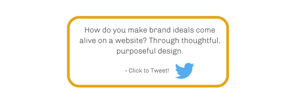
So how do you make brand ideals come alive on a website? Through thoughtful, purposeful design.
The Intent
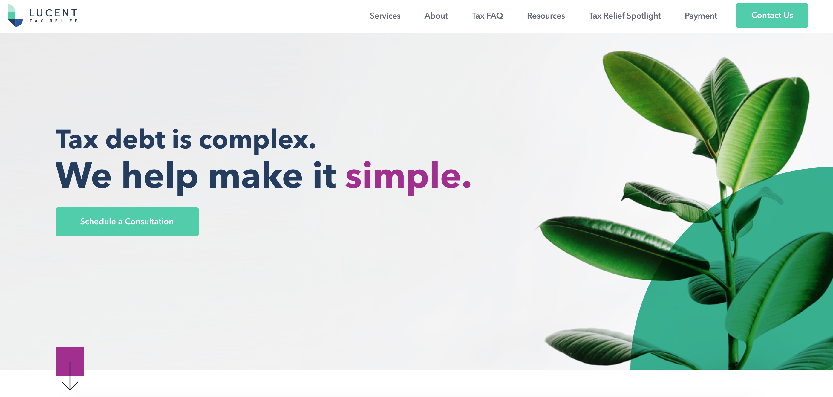
Lucent’s website design is intended to convey the warm, welcoming, and approachable Lucent brand, while retaining a level of professionalism and driving users to conversion. The design aims to ease visitor fear, confusion, and anger by using the soft shapes and colors from the brand. At times, it can even feel therapeutic.
The Startup Website Design
Immediately you’ll notice how clean and friendly the website feels. The hero image of the succulent was selected specifically to avoid the cliche stock photos that we see way too often associated with tax relief. It also aligns with the goal of making the user feel at ease, like they are entering a safe and comfortable place.
The Colors
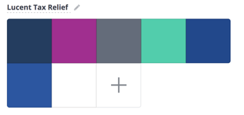
You will find a few prominent colors on the site. The primary green color from the logo was used for the call-t0-action buttons to indicate action. The rounded corners on the CTA buttons add a more friendly aesthetic. We introduced a tertiary brand color (plum) to further differentiate Lucent Tax Relief from its competitors. It also adds a subtle touch of femininity against the blue-green primary colors which by nature are more masculine. There is also color throughout the site design specifically to visually break up sections of content.
In each section, you’ll also notice overlays. These overlays add visual interest through color for a more “own-able” look and feel. You’ll also notice, they use the shapes from the “L” icon in the logo (2 quarter circles, a square, and a rectangle).

Final Thought
Every decision you make should be made purposefully. Design matters! No matter where you are in your growth journey, we’d love to hear from you. If you have questions about digital or know exactly what you need when it comes to marketing, contact us! We can’t wait to learn about what you’re working on and how modern, measurable marketing can help achieve your goals.